From a Brilliant Idea to a Total Failure

Three Design Cases… to Be Reconsidered!
In Washington DC, on a rather unremarkable street just a stone’s throw from the Potomac River, lies what I would call one of the must-visit places for any designer: the “Museum of Failure,” a collection of products and services famous for their spectacular failures among consumers.
While the multinational companies that conceived – and paid for – these projects try to sweep the traces of a dismal result under the rug, the museum’s curators, like bloodhounds, unearth all those products that, after being launched on the market, became famous for their failures. The result of this search still produces a selection of products that leave museum visitors with one and only one question: “How is this possible?”
Take, for example, Apple or Microsoft, Nike or Ford: in our minds, they represent perfect organizations whose products and services dominate the market, redefining our concept of innovation year after year. These big companies are themselves the creators and promoters of new design methodologies that, according to the creators, put the consumer at the center to safeguard their needs. With six-figure budgets and foolproof methods, the result should guarantee perfection, but alas – or rather alas for us – only the intentions are perfect: reality is quite another thing.
Any designer trained in the last thirty years knows well that the ultimate goal of a design process is to create a desirable, feasible, and sustainable solution. More specifically, a new product or service should meet the needs of its target audience, be easy to implement, and have a sustainable business model.
During the design phase, even before starting any production activity, the incorrect or partial consideration of one of the three factors mentioned above can lead to a product development process that starts off on the wrong foot.
If we look at the diagram below, we can see the gaps in the analysis phase that a design process risks carrying with it if one of the three factors is neglected:
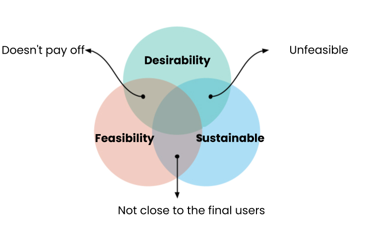
Desirable / Feasible / Sustainable
Design based only on these two criteria will generate a product that will not be able to stand out among the competition because it will not be effective in terms of utility and therefore necessity. The impact of the product for the recipient is zero, and a front-row seat at the “Museum of Failure” is guaranteed.
Desirable / Feasible / Sustainable
No matter how high the expectations are and how winning the business model may seem, planning a design without thoroughly considering the technical limits of implementation will lead the producer to the inevitable interruption of development activities. The product will never see the light of day.
Desirable / Feasible / Sustainable
Without a sustainable business model, an interesting commercialization opportunity will remain just an idea. Nothing more.
Design thinking and other design approaches are created to ensure that in the initial ideation phase, the three factors of desirable, feasible, and sustainable are all managed. It can happen, however, that due to budget constraints or poor hiring decisions, products are developed that, despite lacking one of these key factors, still make it to market – only to fail commercially. Commercial failure is the final point in the story of a wrong product and occurs when the company recognizes, a few years after the launch, that there is no possibility of recovering the investment made to design and produce the product.
A cataclysm. And when the strings are pulled, it’s too late for everything.
Too high or too low a price, excessive engineering, uselessness, and incorrect market positioning are just some of the factors that determine the downfall of a product in the eyes of its audience.
But what are the products whose design failed even before their production? Here are some examples to learn from.
Ford Edsel
On July 4, 1957, the Fiat 500 debuted in Turin: the car for everyone.
Italy and the Fiat 500 together would change the history of mobility worldwide.
In the Ford factories of Michigan, Kansas, and New Jersey, they thought a similar phenomenon would happen with the production of the Ford Edsel.
On October 13, 1957, on CBS, Frank Sinatra and Louis Armstrong announced the Edsel: the car of the future.
The American brand even envisioned the new production as a separate brand within the Ford Motor Company to maximize advertising promotion.
But let’s talk about the car itself: according to its creators, it was supposed to change the way drivers and other car manufacturers viewed design and the automotive industry in general. It was to be, for its time, the car of the future, and indeed it was rich in innovative features.
The instruction manual “Accessories for your first Edsel” listed a quadraphonic audio system, the standard installation of three height-adjustable antennas, a horizontal cylindrical speedometer (with a rotating dome), “rear door safety locks” for families with small children, a plethora of warning lights for oil, gas, and parking brake. The Edsel also boasted innovative ergonomic systems, advanced mats and upholstery, and vibrating elements to alert the driver when the car touched the curb.
The Edsel also had an attractive design inspired by the luxurious Lincolns and Mercurys already on the market. However, in this case, the role of design was also to bridge the gap between cheaper models and luxury cars, targeting the right audience and stimulating interest through style.
The advertising campaigns supporting the car’s launch were substantial with a dual purpose: creating significant anticipation and reassuring investors about the Edsel project, justifying the car’s “grandiosity” with data from market research and other analyses.
It is estimated that Ford spent about $250 million (considering inflation, today it would be several billion) on the design, development, production, and launch of the Edsel, including research and development costs, advertising campaigns, new production equipment, and more.
The commercial failure of the Edsel was spectacular. Contributing to this was an ongoing economic recession – in 1958, the base cost of a standard Edsel was about $2,800, roughly $30,000 in 2023. Consumers who had purchased the new cars began to report serious manufacturing defects, to the point that the name Edsel was humorously reinterpreted as “Every Day Something Else Leaks.” Furthermore, consumers were not impressed by the futuristic look and attractive design: even the unique shape of the grille was mocked, often referred to as a “horse collar.”
In 1960, Ford permanently ceased production of the Edsel.
As designers of products and services, whether tangible or intangible, the story of the Edsel teaches us several fundamental lessons.
Constant engagement with the final recipients of a product is essential. The Edsel designers started involving consumers early on but never considered the results. The desirability of the product was not consistently monitored by investing in “moments of engagement” with consumers at every stage of the design process: the Edsel designers “settled” for an initial phase of research, letting the rest of the design process be mainly influenced by technological novelties. While people are indeed attracted to technological innovations, they are also capable of confirming what already works and is sufficient for achieving a purpose: technological novelty often means new learning, and as often happens, there are never enough data to determine whether those targeted are willing to learn something new. Technology can be crucial for a product’s success, but only when it addresses defined needs.
Managing the energy to backtrack is wise. The Edsel designers never considered the possibility of a flop, simply because they never tested the product. Investments and certainty in the results guided a design without iterations and testing, instead based on intuitions and assumptions founded on the perception of a stable market. Market research and user behavior are very distinct aspects of research and need to be considered together. In the Edsel story, there is always an increase in functionalities, models, and accessories that were never tested until the launch, preventing anyone from “slowing down” the frantic rush to novelty undertaken by Ford. Without a defined vision, Ford entered the market with over 15 different trims.
Design strictly depends on the understanding of the target market. In the case of the Edsel, there was an evident disconnect between the product designers and the consumers in a specific market segment. At the end of the 1950s, consumers could choose from a limited number of models, and the boundary between luxury cars and those intended for the middle class was more than marked. Without conducting any tests during the design phases, Edsel entered a virtually non-existent market with the design of a futuristic and expensive car.
From any viewpoint, the story of the Edsel is characterized by a lack of alignment with the needs and desires of the final consumers, contrasted with excessive certainty towards the intuitions generated within the company. Engaging end users could have certainly mitigated the commercial failure and the significant investment in creating a product that was in many ways “superfluous.”
Juicero

How much is it worth, in economic terms, to squeeze a plastic pouch filled with liquid with your hands? According to Juicero, several thousand dollars a year.
Founded in 2013 and defunct by 2017, Juicero is remembered for its flashy yet useless product supported by a trendy business model.
The problem Juicero sought to solve simply wasn’t a problem.
But let’s start with the idea. Juicero’s mission was to provide and supply fresh and nutritious fruit juices that could be served using the “Juicero Press,” a cold-press juicing machine developed by the company for juice production.
A plastic pouch with a sealed spout at the bottom was inserted into the “Juicero Press” compartment, after which the machine would squeeze the pouch and juice would flow out.
Beyond the usage method, the company’s noble purpose was based on health benefits for the consumer: offering a high-quality product using fresh and organic ingredients, allowing consumers to enjoy the health benefits associated with fresh juices.
The machine offered incomparable features compared to other juicers on the market. For instance, it exerted over four tons of pressure on the ingredient pouches to extract the juice, all without requiring manual effort, making it accessible to everyone. Try squeezing an orange if you have carpal tunnel syndrome (…). Juicero claimed that each juice required a different amount of pressure applied during extraction: the pressing pressure was variable.
The purchase, use, and consumption processes were closely tied to the business model.
A Juicero user, without previously purchasing the machine, could never order the ingredient pouches for the juice. The fruit and vegetable pouches were equipped with a QR code that the machine automatically scanned. The code contained information about the specific characteristics of the ingredient and the pressing instructions.
Users could purchase the pouches through Juicero’s website or via a subscription system, receiving them regularly at home. It’s somewhat like if Netflix sold you a TV to watch its content. It’s akin to the continuous purchase flow when we buy refillable materials on Amazon.
The “Juicero Press,” with its design fitting well into sleek and modern kitchens, even had a touch display that allowed users to read the pressing data during the pouch squeezing cycle.
Now, let’s talk about economic sustainability. The machine cost $699 at market debut and then, defying repricing logic, dropped to $399. The cost of a juice pouch varied from $5 to $8. If you are consumers of fruit juices made from raw materials, I’ll leave it to you to calculate and judge the sustainability of the Juicero experience.
April 19, 2017, was a pivotal day for Silicon Valley and the internet.
A Bloomberg investigation revealed in a video that the same result of the squeezing performed by the “Juicero Press” could be replicated… by hand.
Scissors, hands, and a glass.
Google Ventures, Kleiner Perkins, Campbell Soup are just some of the investors who contributed to the startup’s development. In 2016, in a single fundraising campaign, Juicero raised $120 million: Google Ventures, Kleiner Perkins, and Campbell Soup were among the investors.
In 2017, Juicero permanently closed.
A well-engineered but useless product that should have brought a steady stream of revenue. We all know the sales logic of pod coffee machines: a subscription ensures constant consumption, the machine is a gift (of lesser value), and the coffee is always available, thanks to the pods that arrive continuously according to our subscription with the producing company. Coffee machines and pods are almost always from different manufacturers. The advantage in this example is evident even if the quality of the result is debatable: in the absence of a nearby bar or if there’s no time to prepare a moka, the pod system is a winner.
In Juicero’s case, the company was both a juice producer and – more importantly – a high-end appliance manufacturer. Juicero “asked” its consumers to bear a hefty expense for a beautiful and technologically advanced product as a hook for potential affiliations, only the market it aimed to occupy simply didn’t exist. As designers who center their work around the end-user, we have a duty to understand and participate with data in decisions that impact the commercialization of a product so that, before selling a useless machine for $400, we can understand if the user is willing to “get their hands dirty” to squeeze an orange.
Technology alone is not enough to create new needs. From a user experience perspective, Juicero wanted to create a convenient alternative to the traditional manual juicer. It did so by producing a machine whose parts cost up to $400 for each juicer, all custom-made and with some high-level technological features (scanner). The high engineering of the Juicero product devalued what was perhaps the most noble purpose that the Juicero company pursued: the distribution of healthy ingredients to produce fruit juices at home.
A design approach based on direct user involvement would have redefined “how” the target user wants to produce healthy juices. Probably no one would have wanted to pay $400 for a useless device, but perhaps they would have spent $10 for quality juices.
Juicero was a product, not a solution. We’ve embraced truly bizarre ideas in our lives that were considered – at least at their debut – reckless. If twenty years ago someone on the street had asked you to host them in your home for money, you would probably have said no.
As designers, doing user research means – also – always keeping the north of our ethical compass pointed. Being transparent about a product’s absolute value, even from its prototype state, allows manufacturing companies to avoid gross mistakes like those made by Juicero, especially when a gesture, a ritual as ingrained as squeezing fruit, is at stake. The perceived value of the “Juicero Press” was high, too high compared to its absolute value.
Segway

No urban vehicle makes me think of the dentist like the Segway.
The Segway was developed by Dean Kamen, an American inventor and entrepreneur, and debuted in 2001 with hype comparable to the launch of the first Tesla. It was supposed to change the way people move.
“I believe the impact Segway will have on ‘walking’ will be akin to what the calculator did for the notepad and pencil. Go faster and you’ll go further.”
By 2007, Segway had reached only 1% of its sales goal, and in 2015, the company was acquired.
The Segway uses a technology called “Dynamic Stabilization,” which allows the vehicle to balance automatically based on the user’s movements. To control the Segway, the user leans forward to accelerate forward, or backward to go in the opposite direction. The direction is controlled by turning the handlebar. The vehicle is electric and has two wheels.
Unlike scooters, the wheels are located on the sides of the platform, and the Segway occupies a width of about 60 cm on the road.
Although the launch design wasn’t particularly appealing, we can say that the product’s value proposition has been maintained:
- The Segway is electric, and its consumption is low
- The batteries can be easily recharged both at the office and at home
- It requires no effort to do what it’s designed for
- It’s intended for a very wide audience
- The learning curve is minimal
But then, why did the Segway fail while the scooter boomed?
The cost of a Segway at the beginning was about $5000 – in the US in 2001, this sum corresponded to a middle-upper-class consumer’s six-month savings – and, as a product, it never managed to become mainstream. A pay-per-use model was never defined or proposed, as is the case for current scooters, although it must be said that in 2001 it would have been quite difficult to identify a tool to replace the current smartphone apps that allow scooter use. Therefore, the cost and pricing strategy represented a relatively significant obstacle.
A major obstacle, however, were the regulations of the cities in which Segway was introduced.
Regulations regarding Segway use varied significantly from country to country. In many places, helmets and protective gear were not required, but it was often prohibited to ride on roads and sidewalks. In 2001, bike lanes were still uncommon, further limiting Segway’s accessibility.
The public perception of the Segway was quite varied but never distinctly positive. The shapes and gestures didn’t create that immediate trust in consumers that characterizes some innovations. Furthermore, the design needed to be revised, and soon after the 2001 launch, lighter solutions with more convincing designs emerged.
Segway was an invention rather than an innovation. The Segway patent was filed in 1994 but wasn’t granted until 2001 when Segway was released. The Segway development process involved years of research and development, including collecting user feedback and prototype testing in various situations. But while the technology was innovative, factors unknown to users such as price and regulations for using it only became apparent after its public unveiling.
User research cannot be based solely on usability tests. It’s necessary to place users in a condition of in-depth knowledge, thus using qualitative research methods over data. Asking someone if they feel comfortable riding a Segway while on it is not the same as asking the same person if they would use such a strange and original vehicle to cover the usual 500 meters daily from home to the park.
The context defines the use of the products we create. Although marketing generated too high and unmet expectations, Segway hadn’t considered reality.
In some cities, it was unfeasible, both in terms of safety and legislation and concerning the type of terrain in some metropolises.
User-centered design is defined as such because the user interacts, creates, and modifies the context of use: thinking of the Segway as a work tool without an in-depth investigation into the destination context exposed the product to an unpredictable number of risks and experiments that slowed its announced rise.
The information reported in this article is the result of rather in-depth research on the topics. Nevertheless, our position is always that of observers, sometimes users, but more generally, strangers to the facts. We could never know for sure why Ford’s marketing decided not to follow the feedback from previous target interviews, nor do we know why Dean Kamen designed and built a vehicle with revolutionary ambitions that conflicts with the legislation of some of the world’s largest metropolises in terms of traffic regulations.
Without a doubt, we can learn a lot from these three stories, but as designers, we must pursue design approaches and methods that, without compromise, truly put people at the center to practice sustainable, but above all, ethical design.